Week 4: Visualizing data with matplotlib
Outcome: Students will learn how to make basic plots in Python using matplotlib, the de-facto standard for visualization.
- What we will do:
Code to … draw ?
What is matplotlib + setup check
Basic plotting
Plotting from CSV files
Basic styling
Slightly more advanced styling
Exercise: Recreating the World Health Chart
Code to … draw?
In the last few weeks, we have been learning the basics of coding as a tool to execute logic. It might come as a surprise to you that coding is not all about logic, but can also be applied to generate visualizations. In fact, some people spend significant amounts of time using code to build the visualizations that they need!
- Visualization is typically done as part of data analysis work, to summarize and express the relationships in data in an intuitive manner. A few examples of neat visualizations made in code that you can find online:
In this class, we won’t be making visualizations as impressive as these. These interactive visualizations make heavy use of Javascript-based libraries, of which is out of scope of this course. Instead, we will start small, and take a small step into making plots in Python, with matplotlib.
What is matplotlib + setup check
matplotlib is a widely used plotting library in Python, and is the de facto standard for scientific analysis. It enables users to generate publication-quality plots, and allows heavy customization to get plots that look exactly the way the users want to.
For this class, you will need to be using a local Python installation w/ the matplotlib package installed. If you were using an online REPL for the class, you will need to switch to using an IDE like Spyder. matplotlib is installed by default if you are using Anaconda Python. Else, you will need to install it separately.
If you are able to run the following code chunk and see plot output, you are good to go for today’s class.
import pandas as pd
import matplotlib.pyplot as plt
plt.plot([1, 2, 3, 4], [1, 2, 3, 4])
plt.show()
Basic plotting
Using matplotlib requires you to import it in Python before usage. It is a library that contains functions not available in standard Python. Thus, the act of import-ing the library makes its functions available for us to use. Make sure the following line has been run before using any functions from matplotlib:
import matplotlib.pyplot as plt
plt.plot
plt.plot is one of the most common plotting functions used in the library. Give it sequences of values as x and y, and plt.plot(x, y) will give you a line of y over x.
# Data to plot
days = [1, 2, 3, 4, 5]
covid_cases = [115, 101, 89, 260, 287]

# Plot
plt.plot(days, covid_cases)
plt.show()
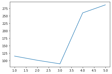
In the example above, we plotted the new COVID cases in Malaysia for Monday to Friday (Sep 28 to Oct 2) in one line. Right now the image looks rather basic, but we will get around to formatting it later in this session.
Note
The plt.show() command prompts matplotlib to display the image instead of waiting for more input. You need to call it to get the plot to show.
If we want to compare the numbers on the plot with the case count from the previous week, we can do that by adding some code to draw the extra line:
# Data to plot
days = [1, 2, 3, 4, 5]
covid_cases = [115, 101, 89, 260, 287]
last_week_covid_cases = [57, 82, 147, 71, 111]

# Plot
plt.plot(days, covid_cases)
plt.plot(days, last_week_covid_cases)
plt.show()
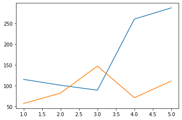
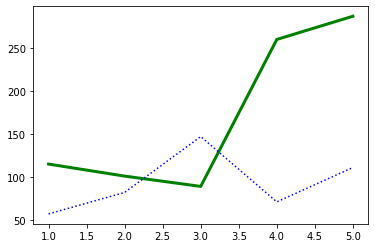
Notice that matplotlib automatically assigned the second line a different colour. Just like when making plots in Microsoft Excel, there are many settings for plotting under the hood. When none of the settings are specified, matplotlib falls back on reasonable defaults, in this case giving each line its own colour. Let’s take a closer look at how we can format the lines from plt.plot.
Formatting plt.plot: color, linestyle, linewidth, transparency, and markers
First we will modify the colour of the lines. Go ahead and add color=”green” inside the first plt.plot, and color=”blue” inside the second plt.plot. You will find that the color of the lines have changed as specified:
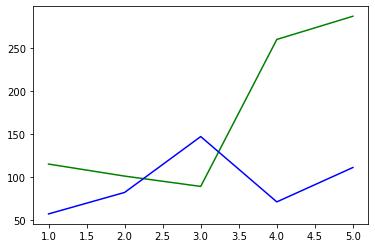
Note
Colour of a line is specified through the color argument (be mindful, of the American spelling!) in plt.plot. There are many ways to set color, either using full names of common colors, specifying an RGB tuple, or providing the hex code of a colour in string!
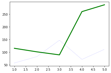
Next, we will adjust the linestyle. By default, the lines plotted are solid lines. We want to change the line that reflects last week’s cases to be a dotted line instead. We can do this by adding ls=”dotted” to the second plt.plot.
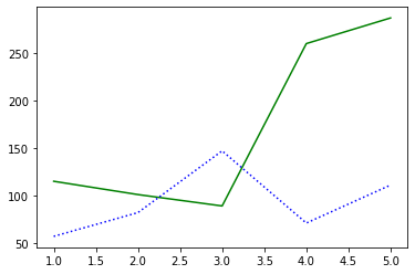
Note
The ls argument decides the line style. Like colour, there are many methods to specify line style. We will focus on providing string argument (e.g. ls=”dashdot”). The available options are: “solid”, “dashed”, “dashdot”, and “dotted”.
Now, we want to specify the linewidth instead. We want to make the line thicker for current cases. The default width is 1. To do this, add lw=3 to the first plt.plot.
Note
lw specifies line width in points. Defaults to 1.
Moving ahead, we want to further make the line representing the previous week’s cases to have some level of transparency. To do this, add alpha=0.3 to the second plt.plot.
Note
The alpha argument denotes transparency. It takes values between 0 and 1. 0 gives a fully transparent line, while 1 gives a fully opaque line.
One last thing; from the looks of our lines, it is not obvious where the data points are. Let us add markers so that we can see exactly where our data points are. Let’s add marker=”o” to the first plt.plot and marker=”x” to the second plt.plot.
At this point, your code should look like this:
# Data to plot
days = [1, 2, 3, 4, 5]
covid_cases = [115, 101, 89, 260, 287]
last_week_covid_cases = [57, 82, 147, 71, 111]

# Plot
plt.plot(days, covid_cases, color="green", lw=3, marker="o")
plt.plot(days, last_week_covid_cases,
                color="blue", ls="dotted", alpha=0.3, marker="x")
plt.show()
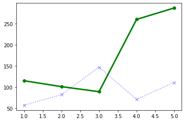
Note
The marker argument marks the exact location of the data point, with the specified shape. Like the other styling options, there are many ways to specify markers. The most common options are “o”, “x”, and “+”.
plt.scatter
At the end of the section above, we have plotted a small dataset and added markers to the plot. If we want to only use markers instead of lines, we can go use plt.scatter.
If you take the code above, and change plt.plot to plt.scatter, you will find that matplotlib will still be able to give you a plot, which will look like this:
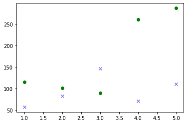
Note
This is a special case! It is possible for plt.plot and plt.scatter to have different arguments. Be mindful when changing from line to scatter.
plt.bar
In the above data, we have been representing the days Monday to Friday by the numbers 1 to 5. As a result, matplotlib gives us a numeric x-axis. Thus, instead of having the x-axis marked by numbers 1 to 5 by default, matplotlib produced a number line with intervals of 0.5. To remedy this, we will be changing the information on our x-axis from numbers to categories, like below:
days = ["Mon", "Tue", "Wed", "Thu", "Fri"]
We will substitute instead a list of strings representing the days of the week. As a result, we will also need to change our plot type for categorical data. This is where a bar plot comes in useful.
Use the following code to plot the modified data as a bar plot:
# Data to plot
days = ["Mon", "Tue", "Wed", "Thu", "Fri"]
covid_cases = [115, 101, 89, 260, 287]

# Plot
plt.bar(days, covid_cases)
plt.show()

Note
plt.bar has a similar format as plt.plot and plt.scatter above. Given x and height, plt.bar(x, height) will produce a bar plot, where the location of each bar is given by x, and the height of each bar is given by height.
plt.axhline
On the bar plot above, let’s say that we want to draw a horizontal line across the plot, to mark 200 cases. We can do that simply by adding the following line to the plot:
plt.axhline(200, color="red")
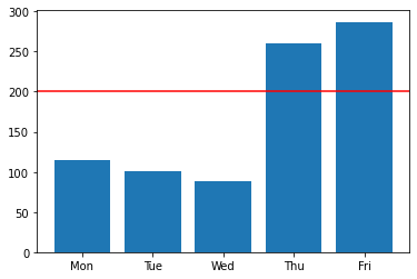
Note
plt.axhline draws a horizontal line on the plot, thus the name hline. The most important argument to pass to this function is the y value where you want the line to be drawn. It also takes other formatting arguments similar to plt.plot above.
To draw a vertical line instead, use plt.axvline.
Plotting from CSV files
In this section, we will learn how to load data from a CSV file, and apply our newfound knowledge to plot it.
Load CSV files using pd.read_csv
Download the CSV from the link given in class, and save it to the same folder that your code is running in. The filename should be mystery_data.csv. Then, run the following code:
import pandas as pd
data = pd.read_csv("mystery_data.csv")
print(data.head())
What do you see?
- Let’s go through these three lines of code.
First, we imported a library called pandas and referred to it as pd. pandas is a library that makes it simple to load and handle data. In a way, you can say it is the Excel of Python.
We imported pandas because we want to use this function, pd.read_csv. As you might be able to guess from the name, this function reads data from a CSV file. The variable data is now a DataFrame in pandas. Think of it as it being now a spreadsheet.
This line prints the first 5 rows of the DataFrame. If you open up the CSV file in Excel, you will see that the data in the CSV file matches up.
Accessing data by columns from DataFrames
Go ahead and run the following code:
print(data.index)
print(data.columns)
print(data["x"])
print(data["y"])
- Compare this with the output from the code before. Notice that:
data.index gives the indices, in a list. Indices represent the length of a DataFrame. In this case, our indices are a range of integers from 0 to 142.
data.columns gives the names of the columns, in a list. Columns represent the width of a DataFrame. In this case, we have two columns, called x and y.
Passing x and y into a square bracket after data allows us to access columns x and y!
Note
The syntax for accessing columns in a given DataFrame in variable data, is data[name], where name is the name of the column.
Make the plot
With this information above, go ahead and make a scatter plot of column x on the x-axis, and y on the y-axis. What do you see? :)
Basic styling
So far from the plots above, we’ve looked at formatting the plot elements, but not the plot figure itself. Let’s look at how to do that, picking up from the line plots above.
We will add the following lines of code:
# Add this line!
plt.figure(figsize=(10, 4))

# Data to plot
days = [1, 2, 3, 4, 5]
covid_cases = [115, 101, 89, 260, 287]
last_week_covid_cases = [57, 82, 147, 71, 111]

# Plot
# Add keyword `label`
plt.plot(days, covid_cases, color="green", lw=3, marker="o", label="This week")
plt.plot(days, last_week_covid_cases, color="blue", ls="dotted", alpha=0.3, marker="x", label="Last week")

# Add these lines!
plt.title("COVID cases from Mon to Fri")
plt.xlabel("Day")
plt.ylabel("Case count")
plt.legend()
plt.show()
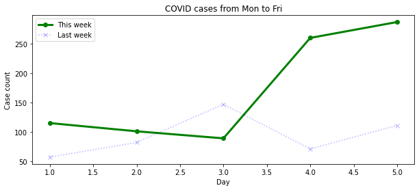
- The lines of code we added has introduced changes to the plot like so:
figure size has changed
plot title is added
plot axes are labelled
plot legend is added
Note
plt.figure() accepts many arguments for plot formatting. In this case, we passed figsize=(10, 4), which sets the figure size to a width of 10 inches by 4 inches.
Note
plt.title() accepts a string as input to set as title.
Note
plt.xlabel() and plt.ylabel() accepts a string as input each, to be displayed as x-axis and y-axis labels.
Note
plt.legend() displays the legend of each plot element (e.g. line, scatter). Note that each plot element needs to add the argument label=<name> for it to show up on the legend.
Slightly more advanced styling
Now we will look at slightly more advanced styling options that are not as commonly used as the above.
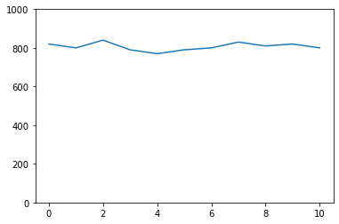
Setting plot limits
matplotlib will automatically adjust the plot limits based on the data plotted. If you want to manually adjust the plot limits, you can use plt.xlim and plt.ylim. They take two arguments each to specify the low limit and the high limit, as the example below:
x = [0, 1, 2, 3, 4, 5, 6, 7, 8, 9, 10]
y = [820, 800, 840, 790, 770, 790, 800, 830, 810, 820, 800]
plt.plot(x, y)
plt.show()
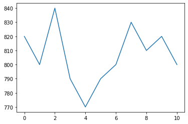
From the plot above, it appears that the data has quite some amount of variation. However, if the plot limits are manually set from 0 to 1000 as below, the variation looks a lot less! Setting the appropriate plot limits are important to ensure your visualization is produced with the intended message.
x = [0, 1, 2, 3, 4, 5, 6, 7, 8, 9, 10]
y = [820, 800, 840, 790, 770, 790, 800, 830, 810, 820, 800]
plt.plot(x, y)
plt.ylim(0, 1000)
plt.show()
Setting scale for log axis
Occasionally we will run into data that are only meaningful when displayed on the logarithmic scale. Look at the code and the subsequent output below that demonstrates how to set the scale for plotting exponential data:
x = list(range(1, 51))

y = []
for i in x:
        y.append(i ** 10)

plt.plot(x, y)
for i in y:
        plt.axhline(i, alpha=0.1, color="black")
plt.show()
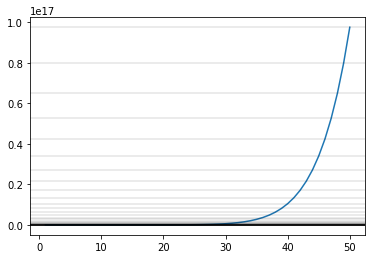
In this plot above, we have drawn straight lines to represent the values on the y-axis. Notice that scale is too big to meaningfully display data from x=0 to 30! If we modify the plotting code to use a log scale, we will be able to better represent the range of data:
plt.plot(x, y)
plt.yscale("log")
plt.show()
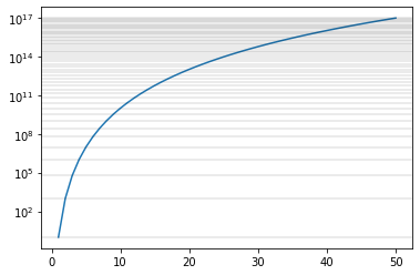
Note
Use plt.xscale or plt.yscale to modify the x-axis or y-axis of the plot. Pass “log” to display in log scale. Default is “linear”.
Representing more than two dimensions of data through scaling point size on scatter plots
Typically, plots represent data in two-dimensions, due to plots only having the x-axis and y-axis. However, it is actually possible to represent more than two dimensions visually, by use specific properties of plot elements. For example, we can manipulate the size of the points on a scatter plot to represent an extra dimension. See the example below:
x = [0, 10, 20, 30, 43, 63, 90]
y = [0, 0, 0, 0, 0, 0, 0]
s = []

for i in x:
        s.append(i ** 2)

plt.scatter(x, y, s=s)
plt.show()
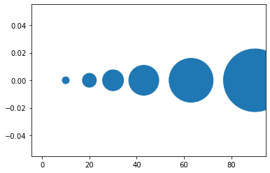
Note
Specify the optional argument s in plt.scatter as above, to set the size of the points.
Displaying grid lines
Notice that our plots do not have gridlines by default. If we want to toggle displaying grid lines in matplotlib, there is a simple function that does that: plt.grid.
Take a look at the code and the output below:
plt.title("Display major axis for x-axis and y-axis")
plt.grid(which="major", axis="both")
plt.show()
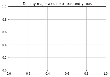
Note
plt.grid has two key arguments, which and axis, and multiple optional arguments, like all matplotlib functions. * Fill in major, minor, or both for which to specify which gridlines to display. Note that plots don’t always have minor axes, depending on the scale. * Fill in x, y or both to choose which axes to display gridlines. * Specify alpha to set the transparency of the gridlines.
Exercise: Recreating the World Health Chart
We now have learnt enough to be able to work on real data. In this exercise, we will be recreating the World Health Chart example seen above.
Data used in the chart for 2020 has been retrieved in advance. Use the link provided in class to download the CSV file, and follow the in-class instructions. Use the following code as a template:
import matplotlib.pyplot as plt
import pandas as pd

# Import data into the variable `df`
# YOUR CODE BELOW

# Making variables for convenience
life = df["life"]
income = df["income"]
pop = df["pop"]
cont = df["continent"]
countries = df.index

# Making the plot
# YOUR CODE BELOW
- Our workflow will be as below:
Load the data
Understand the elements on the original plot
Scatter of income on x-axis, and life expectancy on y-axis.
Set x-axis to be log scale.
Set the x-limits to (200, 151000), and the y-limits to (20, 90).
Specify scatter size by using population, measured in millions (i.e. divide by 1e6).
Specify color by continents! Paste the following as part of the plotting function:
c=cont, cmap="tab10", alpha=0.6
- Label the following:
x-axis with Income per person (GDP/capita, PPP$ inflation-adjusted
y-axis with Life expectancy (years)
title with World Health Map - 2020
Add grid lines to both x-axis and y-axis, with 0.3 transparency.
Package this as a function, so that we can use this for data from different years.
Conclusion
Coding is not all about logic, surprisingly you can use code to draw!
Further reading
Official matplotlib documentation by Matplotlib development team: https://matplotlib.org/contents.html